Happy Mother’s Day to all those that mother! I did some experimentation with Copic markers and stencils for Mother’s Day cards this year. Fun things, Copic markers. Expensive, but for good reason.


Happy Mother’s Day to all those that mother! I did some experimentation with Copic markers and stencils for Mother’s Day cards this year. Fun things, Copic markers. Expensive, but for good reason.
I was commissioned to do a desktop inspirational piece on leadership recently. The parameters required fancy paper and something subtly rebellious. I found deckle edge recycled cotton paper, and did a design in Adobe Illustrator that says “Leadership is helping others grow” with custom mirrored leafy vines. The dot and dash borders are actually morse code and the bottom line says “let me work”. The top line uses more colorful language.
The paper went through my inkjet printer beautifully. I painted the leaves with various colors of iridescent inks, so each piece was unique.
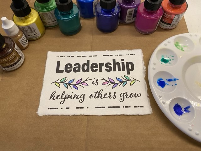
I then suspended the finished paper in a purchased desktop frame that uses two sheets of glass slid into a slot in the side of the frame. I really like the look of suspended art, especially with the lovely raw edge of the paper.

This design is also now available on my brand new TeePublic site!
Site note: My slide over to the blog title: Critters and Craft seems to have worked. The old link ofchickensandcraft.home.blog links to the new crittersandcraft.blog domain. Gotta love dynamic labels.
It is time for the annual making of the bookmarks for my youngest’s teachers. We do this every year and they are always well received. This year was a snow theme and she wanted a snowflake as the “tassel”. To attach the two laminated pieces of paper I punched a small hole and did a few half square knots to make a small section of twisted macrame.
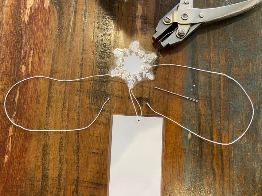

I like the way the half square knots twist. To finish it off, I put a dab of white glue, then trimmed the ends close to the work.
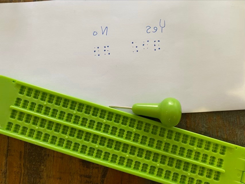
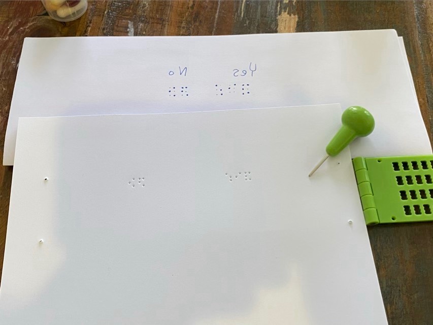
Our chorus was taking a private paper vote and we have a member who reads braille. Making the ballots inclusive was important to me and appreciated by her, and it only took a 15 minutes. I found a braille slate on Amazon, which is a small frame and stylus that makes it easy to get the right spacing for the braille dots. The frame is inexpensive, so I didn’t need to invest in a Braille Writer, which would be good for larger projects. The trickiest part is forming the letters, called cells, backwards. I printed the ballots on card stock because the thicker paper holds the embossed braille better, then used the braille slate to mark “yes” and “no” on each ballot so they were all the same. The ballot was read out loud to all members, then we all marked our ballots with pencil.
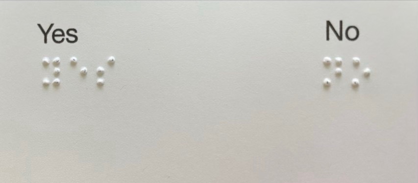
My message here is that often small changes in the way we do things can make big differences in creating inclusive environments. Could she have orally given her vote? Yes, but it wouldn’t have the same feeling of privacy the other members have. Another option to a paper vote would be that we all could have sent in our votes electronically before the meeting instead. There are many different approaches to solving problems, and it usually only takes a little thought and consideration to make processes accessible and inclusive.
I went to my favorite coffee shop and picked up a latte and a couple shots of expresso to go. I drank the latte, but used the expresso to make lots of shapes on water color paper.
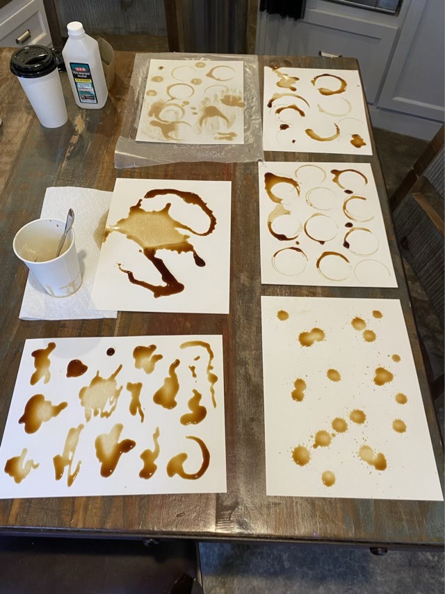
My goal is to digitize the coffee stains to make amalgamated coffee art. First up, a coffee tree. Although I intended to use the shapes to make the tree, I decided to also try just painting an evergreen tree with expresso. It turned out great, so that turned into my base image. I scanned everything, including a scattering of sugar sprinkles. I digitally combined the tree, sprinkles, and a precisely placed coffee ring, and am quite pleased with the result. For fun, I changed the color of the sprinkles in Photoshop so I had two options.
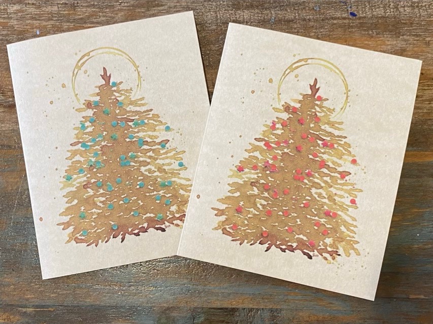
These cards are sold exclusively at The Full Cup in Weatherford, TX.
