The Baize Shetland wool was the first Livestock Conservancy Shave ‘Em to Save ‘Em fiber I purchased. I bought a 13 oz batt, and have been spinning it at demonstrations and fair booths. I’ve been quite remiss in actually making a fiber page! That is now rectified, and this wonderful fiber has a page in my sampler book.
Photo description: Post card from the breeder (top left), single spun and two ply yarn (top right), unspun wool as purchased scoured and carded (middle left), crochet round (middle right), two Shetland lace knit samples (bottom left), nålbinding (bottom middle), and a woven swatch with combed fringe.Photo description: same page, but with the samples folded up to show the descriptions
Shetland wool is a joy to spin, and is definitely on my “will purchase again” list.
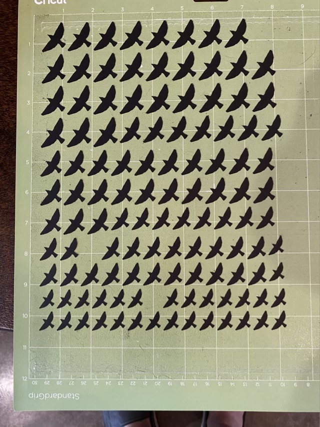
I love my little mossarium, and keep looking for tiny things to add: little plants from the yard, lichen, birds. Birds! I cut out flying bird silhouettes on my Cricut from black cardstock, and hung them from monofilament attached to a wire mobile.
Photo description: more card stock black bird cutouts than I needed in four sizes on a green Cricut mat
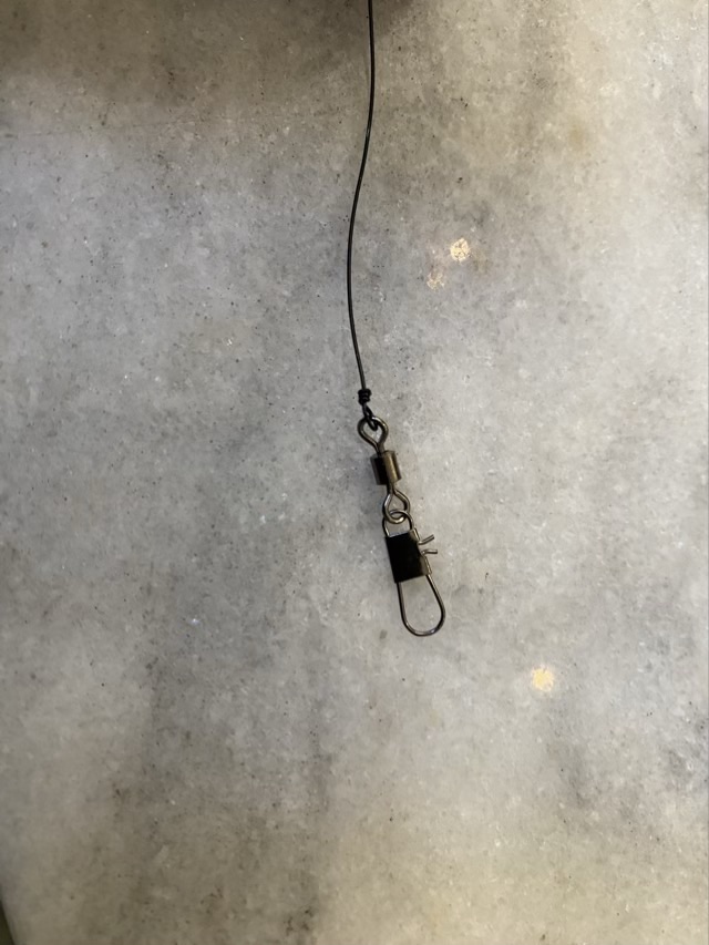
I used 22 gauge black coated copper wire to hang a fishing swivel on the inside of the terrarium.
Photo description: small fishing swivel connected to black wire with a closed loop
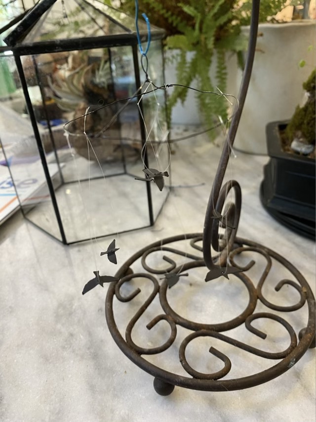
I made a circle of wire with a cross bar and loop, and hung it from a banana stand so I could balance it as I added the birds, which had monofilament strung through the body area. I only needed seven of the smallest birds I cut, the rest will be saved for other projects. I used super glue to tack the line onto the wire because I didn’t want the line to slide along the wire, and I didn’t want to add weight by making wire loops.
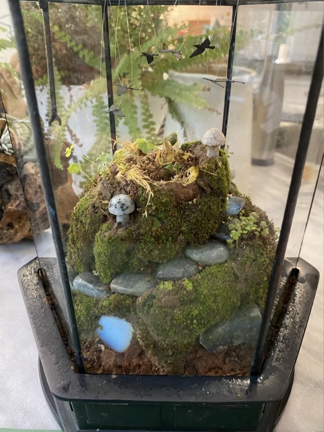
Photo description: tiny bird mobile hanging from a banana stand, terrarium lid in the background Photo description: mobile in place in the terrarium lid, showing the wire circle hanging from the fishing swivel attached to the peak of the lid and the birds hanging downPhoto description: terrarium lid in place over the moss covered mini landscape
Here is a 5 second video of the birds “flying”. I put the terrarium on a small lazy susan, so when I turn it, the birds turn at a different rate, and will continue to spin briefly when the turntable stops. The swivel doesn’t spin as freely as I would like, but this is a happy start.
Happy Mother’s Day to all those that mother! I did some experimentation with Copic markers and stencils for Mother’s Day cards this year. Fun things, Copic markers. Expensive, but for good reason.
Photo description: two cards with “Happy Mother’s Day” written in blended inks from red to green, Copic markers in the foreground, Cricut cut stencil in the background
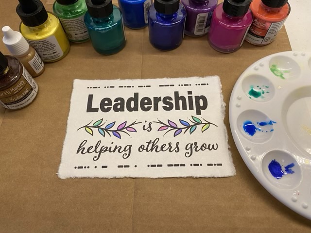
I was commissioned to do a desktop inspirational piece on leadership recently. The parameters required fancy paper and something subtly rebellious. I found deckle edge recycled cotton paper, and did a design in Adobe Illustrator that says “Leadership is helping others grow” with custom mirrored leafy vines. The dot and dash borders are actually morse code and the bottom line says “let me work”. The top line uses more colorful language.
The paper went through my inkjet printer beautifully. I painted the leaves with various colors of iridescent inks, so each piece was unique.
Photo description: Deckle edge paper printed with black ink and colored with iridescent inks on cardboard surrounded by ink bottles and a paint pallet.
I then suspended the finished paper in a purchased desktop frame that uses two sheets of glass slid into a slot in the side of the frame. I really like the look of suspended art, especially with the lovely raw edge of the paper.
Photo description: Light wood frame with suspended art in the foreground, an additional two frames just visible in the background.
This design is also now available on my brand new TeePublic site!
Site note: My slide over to the blog title: Critters and Craft seems to have worked. The old link ofchickensandcraft.home.blog links to the new crittersandcraft.blog domain. Gotta love dynamic labels.
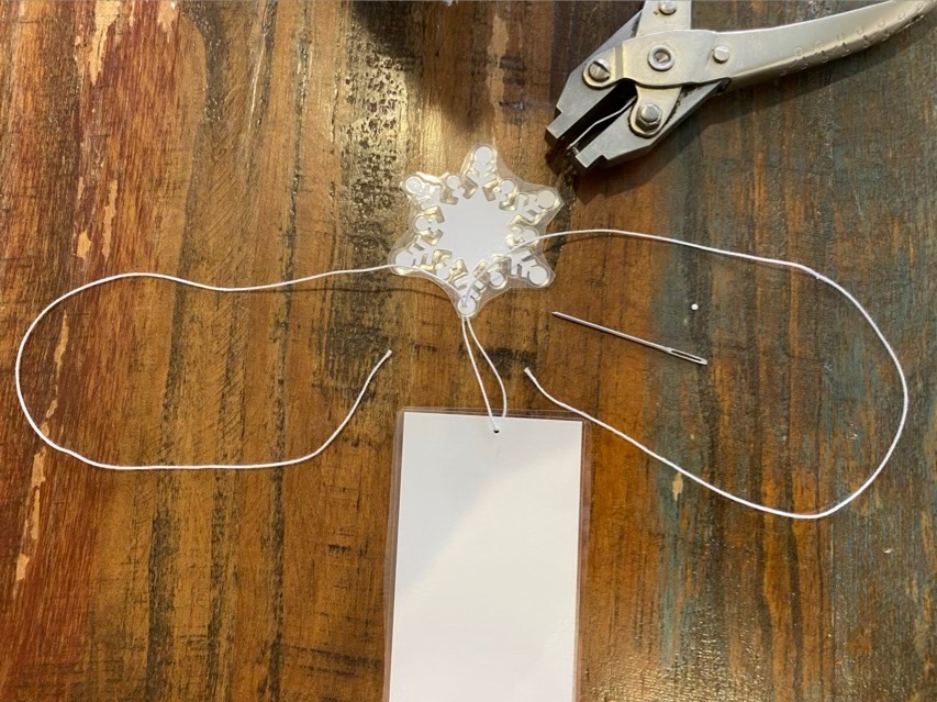
It is time for the annual making of the bookmarks for my youngest’s teachers. We do this every year and they are always well received. This year was a snow theme and she wanted a snowflake as the “tassel”. To attach the two laminated pieces of paper I punched a small hole and did a few half square knots to make a small section of twisted macrame.
Photo description: The setup. The book mark and snowflake have been hole punched and a piece of #10 cotton has been run through the bookmark side, then both ends of the cotton have been threaded through the snowflake side.Photo description: same book mark with half square knots made with the ends of the cotton around the two threads connecting the pieces.
I like the way the half square knots twist. To finish it off, I put a dab of white glue, then trimmed the ends close to the work.