I had a post on social media recently and didn’t catch the autocorrect until after I posted. I usually reread what I write at least three times (yup, it takes me forever to text), but I just missed this one. When my sister pointed it out, I decided I rather liked it. “Well, carp!” is now in my phrase box. And it needed a visual, so I did up a small pencil drawing. Maybe when I have time in the future I will polish it up in Illustrator. Along with the other pencil sketches filling a folder…
I have found a wonderful book: The Organic Artist: Make Your Own Paint, Paper, Pigments, Prints, and More from Nature by Nick Neddo. This is right up my alley! I haven’t read it all yet, but we had the opportunity to try making our own charcoal for drawing when I needed to make some wood ash for the dust bath for the chickens.
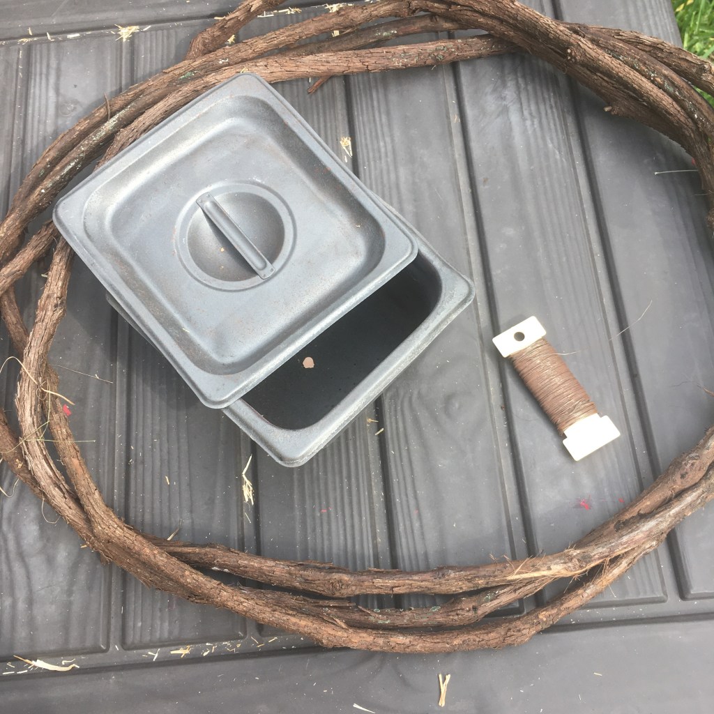
Grapevine, metal container, and steel wire
I had a grape vine wreath that I made over a year ago. It has been aging in the woods for awhile but was readily available for a new purpose. I also had a steel container that I used with my kiln that was a great shape for making charcoal (and it was already seasoned!) My eldest and I used pocket knifes to scrape the bark off sections of grapevine, and then we packed the container with the sticks and closed it securely with twists of wire.
Pocket knife and debarked grape vine
We used the bark shavings as tinder, and built the fire around the steel box. I love it when I can light a fire with one match (it helped that I also used a bacon grease soaked paper towel with the bark shavings). We let the fire burn down, then cool before we checked the box. The charcoal sticks were perfect! Solid black all the way through and a nice texture for drawing.
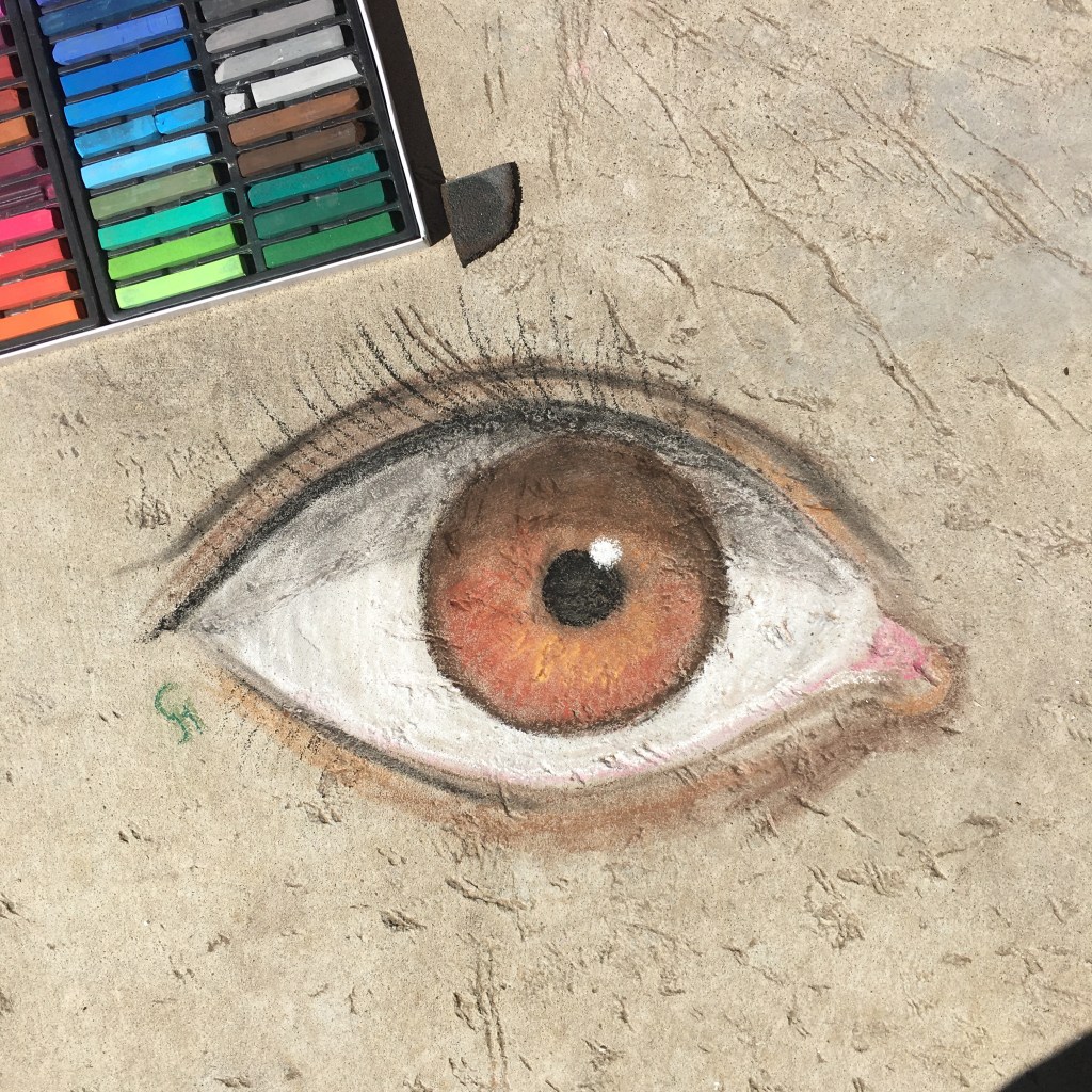
I just had to try drawing with it, so I did a quick sketch of some grapes on the concrete (Nick Neddo makes drawings of the source of his art materials, so it seemed appropriate).
I am loving soft pastels as sidewalk chalk! I didn’t care for them much in school, but for blending and color intensity, they knock the socks off “sidewalk” chalk. We tore little bits of foam off the packing to use for blending, which is the secret key for art on bumpy concrete.
Yes, I drew an eye. At least it is a right eye this time, as I typically default to left. I’m trying to give equal time and effort. I’d hate for an eye to feel left out. That just wouldn’t be right. Left on their own, they save face and stay right together anyway.
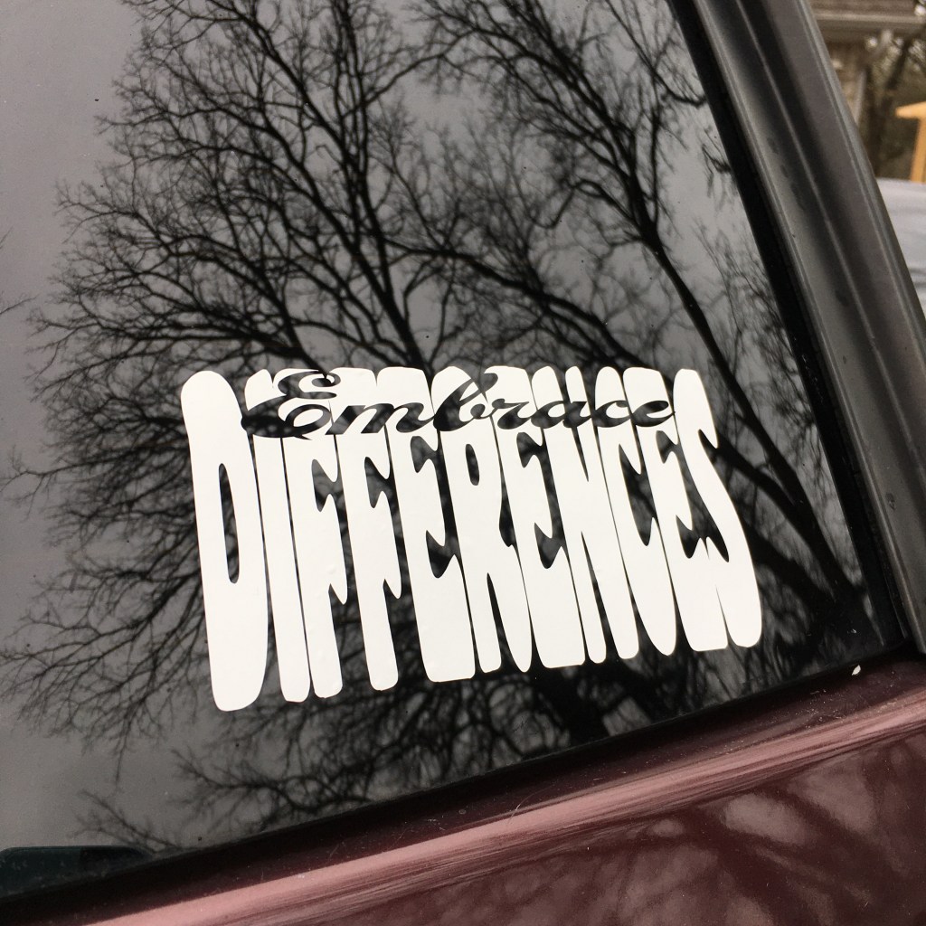
Uh oh, the outdoor vinyl cutouts are very addicting. I made the castle for my husband’s truck, the dragonfly for my vehicle, and then the other corner of my window needed updating too. I just happened to have some white premium vinyl that I used on the kid’s water bottles. That stuff has stuck on fast even with weekly trips through the dishwasher. But what to advertise to everyone sitting behind me at traffic lights? I wanted some variation on the theme that it is good that everyone is different; it would be a terrible if we were all the same. But that is a lot of text to squeeze onto a sticker. So I used two words: Embrace differences.
Embrace Differences vinyl cutout
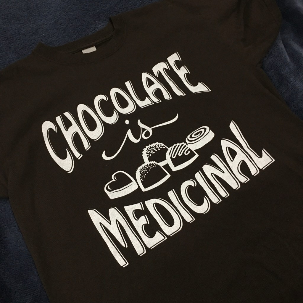
I created the graphic in Adobe Illustrator and used my Cricut cutter to cut the vinyl. I like the negative space “Embrace”. I also put this out on my Redbubble shop as a t-shirt design in white and black. The solid color prints come out nicely, with a bit of variation from the knit material, which I like. Below is a different design I had printed on a brown shirt.
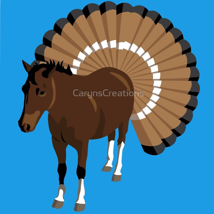
I made this image for a friend who did a Thanksgiving horse camp. The pony looks so cute and offended by his new tail, I thought I would share with you all as well.