
My chorus uses a cheat sheet for performances: a piece of black poster board folded over the director’s stand with the songs we are going to sing, the key pitch, and helpful reminder words. I ran an interesting experiment with fonts, making the same set up twice, one with a standard serif font and one with OpenDyslexic font. I numbered photos and put a poll out on our members only site.
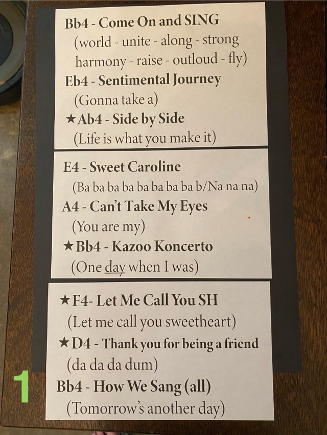
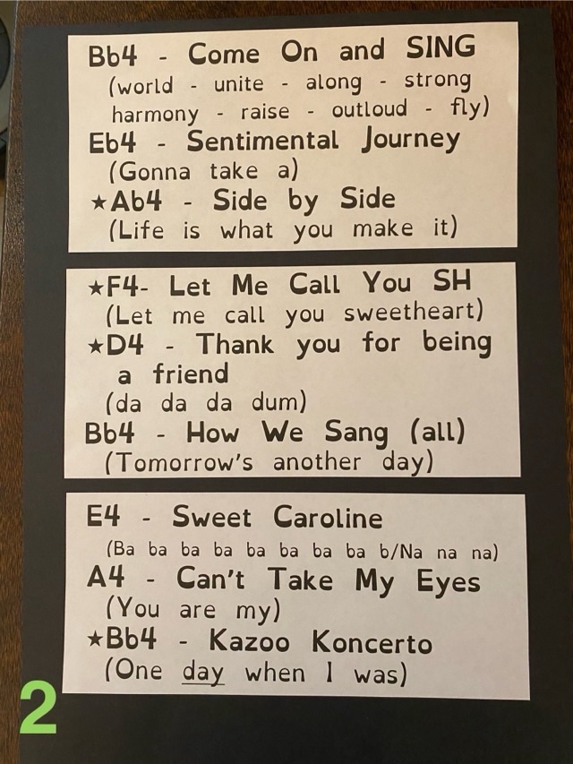
The chorus response was overwhelmingly for the OpenDyslexic font as the easier option for quick and easy reading. Is it a pretty font? No, but for something you need people to actually read and not get lost in, font choice is key. I do really like the bottom weighted font idea, and that the letters are all unique and can’t be flipped or mirrored to make a different letter.
